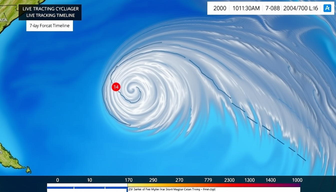
A cyclone watch appears on your phone, and suddenly everyone wants to know where the storm is heading. The official Bureau of Meteorology cyclone tracking map is the tool that answers that question — but only if you know what each symbol and colour means. This guide walks through how to find, read, and act on the BOM cyclone tracking map so you can make informed decisions when it matters most.
Update frequency: Every 6 hours (or more frequently during active cyclones) · Coverage area: Australian region including QLD, WA, NT, and surrounding waters · Data layers: Forecast track, satellite imagery, warning zones, intensity scale · Official source: Australian Bureau of Meteorology (BOM) · Access: Free via website and mobile app · Time range: 7-day forecast for named tropical cyclones
Quick snapshot
- Real‑time cyclone positions (Bureau of Meteorology – official forecast map)
- Automatic update every 6 hours (Bureau of Meteorology – official forecast map)
- Interactive zoom and pan (Bureau of Meteorology – official forecast map)
- Infrared and visible imagery (NOAA NESDIS – satellite monitoring guide)
- Cloud patterns and cyclone structure (NOAA NESDIS – satellite monitoring guide)
- Overlaid with forecast track (NOAA NESDIS – satellite monitoring guide)
- Predicted path for 7 days ahead (Bureau of Meteorology – 7‑day forecast)
- Uncertainty cones for each time step (Bureau of Meteorology – 7‑day forecast)
- Intensity categories (Cat 1–5) (Bureau of Meteorology – 7‑day forecast)
- Queensland, Western Australia, Northern Territory (Bureau of Meteorology – regional zoom)
- Localised warning zones (Bureau of Meteorology – regional zoom)
- Coastal impact areas (Bureau of Meteorology – regional zoom)
Six key facts about the BOM cyclone tracking map, drawn from the official product page:
| Label | Value |
|---|---|
| Primary source | Bureau of Meteorology (BOM) |
| Update interval | Every 6 hours (standard); more frequent during active cyclones |
| Coverage | Australian region (including QLD, WA, NT, Coral Sea, Indian Ocean) |
| Access methods | Website (bom.gov.au), BOM Weather app, third‑party sites (e.g., Windy) |
| Mobile support | Yes – BOM Weather app for iOS and Android |
| Languages | English (primary) |
Where can I find a live BOM cyclone tracking map?
The official source is the Bureau of Meteorology’s tropical cyclone 7‑day forecast page (Bureau of Meteorology – official public map). This page displays an interactive map that updates at least every six hours — more often when a cyclone is active. A direct link takes you straight to the national view, where you can zoom into any region. For broader context on severe weather events, see our coverage of the East Coast Weather Bomb Cyclone 2026.
Direct link to the BOM cyclone forecast map
- Load
bom.gov.au/cyclone/7dayforecastin any browser. The map loads automatically. - No account or login required. It is free for all users (Bureau of Meteorology – map access note).
- The map refreshes every 6 hours (00, 06, 12, 18 UTC) as a minimum (Bureau of Meteorology – update policy).
Alternative access via BOM mobile app
- The BOM Weather app (Apple App Store – official BOM app) provides push notifications for warnings and access to the same tracking data.
- Available for iOS and Android (Google Play – BOM Weather app).
- Activate notifications to receive real‑time alerts for your saved locations (Bureau of Meteorology – app recommendation).
Australians who rely on the web version get the fullest map view, but the mobile app is the only way to receive push alerts. For coastal residents, the app should be the default for safety.
What this means: You can access the exact same forecast data from any device. The choice between browser and app comes down to whether you want automatic warnings or a larger map screen.
How to access the BOM cyclone tracking map for specific regions?
The national map covers the entire Australian region, but regional views are built into the same interface. Zoom to Queensland, Western Australia, or the Northern Territory to see localised warnings and satellite overlays.
Queensland (QLD) regional map
- From the main map, either zoom to the Queensland coast or use the search box to centre on a city like Cairns or Brisbane.
- BOM provides region‑specific pages linked from the main forecast map (Bureau of Meteorology – regional access).
- For the Coral Sea, the map includes the same 7‑day forecast and satellite layer.
Western Australia (WA) satellite live overlay
- The satellite live layer is available under the “Satellite” tab on the map (Bureau of Meteorology – satellite layer).
- WA’s vast coastline means satellite imagery is especially useful for tracking cyclones far from observation stations.
- Infrared and visible bands are both available (NOAA NESDIS – satellite bands explained).
Northern Territory (NT) tracking map
- NT areas (including the Gulf of Carpentaria) are covered by the same national map with zoom functionality.
- Zoom to the Top End coast to see watch and warning zones colour‑coded for intensity.
Residents of QLD, WA, and NT face different cyclone risks. The regional zoom lets you see exactly where your town sits relative to the forecast track — no more guessing whether “Coral Sea” includes your suburb.
The pattern: BOM has centralised the map, but the regional context emerges through zoom and layer toggles. For local emergency planning, always check the warning zone shading, not just the cyclone symbol.
How do I view the BOM cyclone tracking map with satellite imagery?
Satellite imagery shows the actual cloud shield and structure of a cyclone, while the forecast track is a model prediction. Overlaying both gives you a reality check on where the storm really is versus where models think it will go.
Enabling the satellite overlay
- On the 7‑day forecast page, click or tap the “Satellite” tab above the map.
- You can toggle between infrared and visible imagery. Infrared works day and night; visible shows finer detail during daylight hours (NOAA NESDIS – satellite types).
- The forecast track and warning zones remain visible on top of the satellite layer.
Understanding satellite imagery vs. forecast track
- The satellite view uses real‑time data from the Himawari‑8 satellite (Bureau of Meteorology – satellite source).
- What you see: actual clouds. The forecast track (white line with arrows) shows where the low‑pressure centre is predicted to move.
- If the cyclone looks ragged or sheared on satellite, the forecast track may change quickly — hence the uncertainty cones.
Satellite imagery updates in near‑real time, but the forecast track only refreshes when a full advisory is issued (every 6 hours). A fast‑changing storm can look one way on satellite and be predicted differently on the track line. Always use both layers together.
The trade-off: Satellite gives you the present; the forecast track gives you the future. The gap between them is where uncertainty lives. For safety, treat the satellite image as ground truth and the forecast line as a best‑estimate guide.
What does the BOM 7-day cyclone tracking map show?
The 7‑day forecast map packs a lot of information into one screen. Understanding the symbols and colours is the difference between knowing a cyclone is “somewhere out there” and knowing exactly how close it will get to your location.
Forecast track and uncertainty cones
- The centre line with arrows shows the cyclone’s most likely path (Bureau of Meteorology – track map video).
- The grey zone around the line — the “cone of uncertainty” — shows where the cyclone centre could be in the next 72 hours (Bureau of Meteorology – cone explanation).
- Beyond 72 hours, the cone widens because model predictions become less certain.
Intensity categories (Category 1–5)
- The number inside the cyclone symbol is the category, from 1 (weakest) to 5 (most severe) (Bureau of Meteorology – intensity number).
- Coloured circles around the track indicate the extent of damaging (gale force), destructive (storm force), and very destructive (hurricane force) wind gusts (Bureau of Meteorology – wind gust circles).
- Category 5 cyclones produce winds exceeding 280 km/h and can level well‑built structures.
Warning zones and watch areas
- Darker orange shading = warning area within the next 24 hours (Bureau of Meteorology – warning shading).
- Lighter orange shading = watch area where gale force or destructive winds could occur in 24–48 hours (Bureau of Meteorology – watch shading).
- These zones are the most critical for emergency planning: they tell you when to start preparing and when to take shelter.
If your location falls inside a darker orange zone, BOM expects destructive winds within a day. That is the trigger to complete your preparations and move to your cyclone shelter plan.
The implication: The map is not just a forecast for meteorologists — it is a decision tool for families, businesses, and emergency services. The warning zone colours are designed to prompt action.
How often is the BOM cyclone tracking map updated?
Knowing the update schedule helps you avoid checking a map that may be hours old. BOM follows a strict routine with extra advisories during dangerous storms.
Standard update schedule
- The map updates at least every 6 hours: at 00, 06, 12, and 18 UTC (Bureau of Meteorology – update schedule).
- Australian Eastern Standard Time (AEST) is UTC+10, so the updates correspond to 10am, 4pm, 10pm, and 4am AEST.
- This schedule matches the main global model runs used by BOM.
Real‑time updates during active cyclone events
- During severe cyclones, updates may occur every 3 hours — or whenever new observations are available (Bureau of Meteorology – special advisories).
- BOM issues special advisories outside the standard schedule if conditions change rapidly (e.g., rapid intensification or a sudden track shift).
- These special updates are flagged on the website and pushed as alerts through the BOM Weather app.
During cyclone season, do not rely on a single check per day. A storm can change course in three hours. Set app notifications so you don’t miss an off‑cycle advisory.
The pattern: the update frequency correlates with risk. In quiet periods, 6‑hourly is standard. In active cyclones, the cadence tightens. Treat the map as a live resource, not a static poster.
How to read the BOM cyclone tracking map in 3 steps
These steps turn the map from a confusing set of lines and colours into a clear safety briefing.
- Identify the warning zone. Look for orange shading near your location. Darker orange = take action now. Lighter orange = prepare within 24 hours.
- Check the cyclone category. Read the number inside the cyclone symbol. If it is Category 3 or above, expect strong structural impacts and follow local emergency advice.
- Follow the track line and cone. The arrowed line shows the most likely path; the grey cone shows where the centre could stray. If your town is inside the cone, you need to monitor closely.
For a detailed walkthrough, watch Bureau of Meteorology’s official video on track maps. For updates on specific storms, see our coverage of the Latest on Cyclone Alfred: Path, Slowdown, and Flood Risk.
Timeline signal
- November 2025: Start of 2025–26 Australian cyclone season (Bureau of Meteorology – seasonal outlook)
- January 2026: Cyclone Koji crosses coast between Ayr and Bowen (Facebook post, 11 Jan 2026)
- Every 6 hours: BOM issues updated cyclone tracking map and warnings (Bureau of Meteorology – update schedule)
- Peak season (Jan–Mar): Highest frequency of tropical cyclones in Australian region (Bureau of Meteorology – seasonal patterns)
Confirmed facts & What’s unclear
Confirmed facts
- BOM is the sole official source for Australian cyclone tracking maps (Bureau of Meteorology – official)
- Map updates occur at 00, 06, 12, 18 UTC as a minimum (Bureau of Meteorology – schedule)
- The 7‑day forecast is based on computer model ensemble predictions (Bureau of Meteorology – methodology)
- Satellite imagery comes from Himawari‑8 satellite (NOAA NESDIS – satellite source)
What’s unclear
- Exact time of next non‑scheduled update during rapid intensification events
- Whether certain regional overlays (e.g., QLD satellite only) update with the same frequency as the national map
- How forecast track accuracy varies between days 1–3 and days 4–7 (model performance not published by BOM)
- Whether the map displays real‑time lightning data or only cloud patterns
Expert perspectives
“The maps show the cyclone’s likely path, intensity and any locations that are likely to be impacted.”
Bureau of Meteorology – official video on track map interpretation
“Satellite observations help meteorologists monitor and track severe weather events as they happen.”
NOAA NESDIS – education guide on weather map reading
“This map shows 7 day forecast information for tropical cyclones around Australia.”
Bureau of Meteorology – official 7‑day forecast page description
The BOM cyclone tracking map is a free, authoritative tool that condenses complex meteorological data into a visual guide for the public. But its value depends on how well you read the warning zones, understand the cone of uncertainty, and stay updated during active storms. For anyone living in cyclone‑prone Queensland, Western Australia, or the Northern Territory, the choice is clear: learn the map legend before cyclone season starts, or risk reacting too late when the orange zone already covers your street.
Frequently asked questions
What is a tropical cyclone?
A tropical cyclone is a low‑pressure system that forms over warm ocean waters and produces strong winds, heavy rain, and storm surges. In the Australian region, they are called cyclones; in the Atlantic, hurricanes.
How are cyclones named?
Cyclones are named from a list maintained by the Bureau of Meteorology. Names alternate between male and female. The 2025‑26 list includes names like Koji, Alfred, and Zelia.
What is the difference between a cyclone watch and a cyclone warning?
A watch means gale‑force winds could occur within 48 hours; a warning means destructive winds are expected within 24 hours. The BOM map shows watches with lighter orange shading and warnings with darker orange shading (Bureau of Meteorology – watch vs warning).
How to prepare for a cyclone?
Prepare an emergency kit (water, food, first aid), secure loose outdoor items, identify the strongest room in your home, and stay tuned to the BOM map and local emergency services. For full guidance, see Queensland Government – Get Ready.
Can I download the BOM cyclone tracking map for offline use?
No, the map is online‑only and requires a live internet connection. However, you can save screenshots of the forecast track and warning zones for offline reference. The BOM Weather app caches some data when connected.
What do the colours on the BOM cyclone tracking map mean?
Orange shading indicates warning/watch zones (darker = warning, lighter = watch). Coloured circles around the track show the extent of wind gusts (yellow for gale, orange for destructive, red for very destructive). The grey cone shows forecast uncertainty (Bureau of Meteorology – colour legend).
How does the BOM tracking map compare to other services like Windy or AccuWeather?
BOM is the official government source and uses the same data as emergency services. Windy and AccuWeather may use the same global models but are not endorsed by Australian authorities. For official warnings, always use BOM (Bureau of Meteorology – official source).

Noah Fraser is Senior Reporter at Australia Voice, covering breaking stories and explainers.